Brand Standards

Fonts and typography

The words we choose are an important part of our brand voice, but so is the way those words look. The way our words look is established by the fonts that we use and the way that we use them, also known as typography. The Red Hat® font family was designed for the Red Hat brand by type designer Jeremy Mickel in collaboration with our design teams. 

In our font family, each character is made up of perfect circles and straight, even lines. The effect is a geometric, rational, and engineered font with human touches inspired by our brand’s history. The open feeling of the individual letters balances the tight spacing in between letters.

Red Hat font family hero image

Our fonts are open licensed under the SIL International license and are available for anyone to download and use. To use our fonts, you can: access them preloaded in templates, download and install them from GitHub, use them as web type, add them to your Google Fonts options, or find them pre-installed on Red Hat-issued computers.

Red Hat materials using Red Hat fonts
This

Download our Red Hat fonts to create Red Hat materials.

Red Hat materials using Red Hat fonts
Not this

Do not use other fonts for Red Hat materials.

Red Hat fonts

Red Hat Display weights and styles

Red Hat Display

Red Hat Display is used in headlines and to make big statements. Because Red Hat Display is intended for large sizes, it has more of our brand personality and voice, with even strokes, tight spacing, and tall, open letterforms. If you do not know which font to use, default to Red Hat Display.

Download Red Hat Display
Red Hat Text weights and styles

Red Hat Text

Red Hat Text takes all of the personality from Red Hat Display and optimizes it for more demanding applications. It is easy to read in paragraphs and very small sizes, like in a whitepaper or a tooltip in an interface.

To increase readability at small sizes, Red Hat Text has more height difference between the upper- and lowercase letters, more space between narrower characters, and more variation in the line weight.

Download Red Hat Display
Red Hat Mono weights and styles

Red Hat Mono

Red Hat Mono is our monospaced font that was created to distinguish code from natural-language text. It should only be used when demonstrating code snippets in our communications and specifications, or as a stylistic approach for a more technical audience, like the Red Hat Developer Program or Command Line Heroes.

Download Red Hat Mono
Noto Sans weights and styles

Global type

Red Hat Display and Red Hat Text support the extended Latin character set and work for most European languages. For other languages like Chinese, Japanese, Korean, and Cyrillic, use the Noto Sans font family.

Noto is an open licensed font family from Google that was developed to support all languages without the little boxes—known as tofu—that show up when a font does not support a character. The simple, clean design makes it a good counterpart to the Red Hat type family.

Download Noto Sans
Mini-spot illustration representing alignment

What about variable fonts?

The variable version of our fonts includes weight as a variable option, and are best used on web properties to decrease load times. When using variable fonts, stick to the named weights (regular, bold, etc.) for consistency across applications. If your desktop app doesn’t support variable fonts, use the traditional version instead.

Key principles of typography at Red Hat

Whether you’re using type to simply convey information or are using it as an expressive design element, apply these principles to ensure that your typography looks and feels like Red Hat.

Use sentence case

We use sentence case—not all caps or title case—in Red Hat materials, including headlines (we use title case for job titles). Type in all caps implies that we are yelling or overly aggressive. Sentence case is more authentic, friendly, and realistic, and it lets capitalized words stand out. For guidance on capitalizing words, review the Red Hat corporate style guide.

Red Hat materials using Red Hat fonts
This

Always use sentence case in Red Hat materials, even for headlines.

Red Hat materials using Red Hat fonts
Not this

Do not use all caps or title case.

Use one kind of emphasis

When differentiating words in context, we either bold, italicize, or change text to an approved brand color, but we use only 1 style at a time. We bold for emphasis when writing digital copy and italicize when writing collateral. When creating presentations, ad copy, and social graphics, we can use any of the 3 but only 1 treatment at a time.

Red Hat materials using Red Hat fonts
This

Use 1 treatment to create hierarchy or emphasis.

Red Hat materials using Red Hat fonts
Not this

Do not use more than 1 type of emphasis at a time.

Allow for white space

The empty space around the elements of any design is known as white space. Using white space effectively can highlight our message and help communicate some of the key attributes of our brand personality.

Leaving plenty of white space makes our brand feel open and inviting, and focusing on 1 or 2 key messages instead of filling every space makes our brand feel confident and bold.

Red Hat materials using Red Hat fonts
This

Use a lot of white space and minimal text, and leave a margin.

Red Hat materials using Red Hat fonts
Not this

Do not crowd a small space with a lot of text or eliminate a margin to create space for text.

Photograph of a Red Hat Summit 2019 display showcasing Red Hat brand history.

Functional type

Functional type conveys information and is often found in presentations, letterheads, templates, and collateral.

Functional type is readable, legible, and straightforward. Its letters are not edited or moved around. It can be small and informative, like a paragraph explaining technical information; and it can be bold and assertive, like a big headline.

Learn more about functional type
Photograph of a Red Hat Summit 2019 display showcasing Red Hat brand history.

Expressive type

Type can be more than informational—it can also be used to grab attention, emphasize an idea, or add to the literal meaning of words. Expressive typography uses stylized type in a way that is more like image than text. It evokes a feeling or emotion in a way that a block of type does not.

Explore the possibilities, but keep in mind that expressive type can make translation, editing, and customization more complicated.

Learn more about expressive type

Typography in use

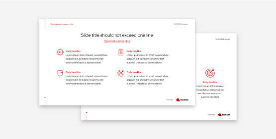
Functional type in Red Hat presentation templates

Our presentation templates use Red Hat Display and Red Hat Text as functional type to clearly communicate to our customers, partners, and associates while looking and feeling like Red Hat.

Social media graphic using expressive type

Expressive type is used successfully as imagery in support of the functional type in this social graphic.

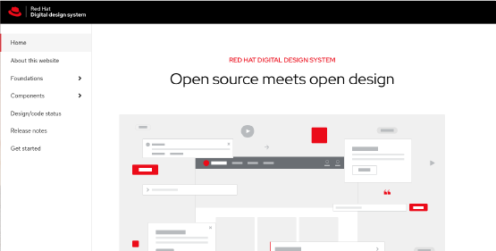
Red Hat's Digital Design guidelines webpage

Using Red Hat fonts on our web properties allows for consistency and extends our brand presence. Learn more about how to use type on the web.

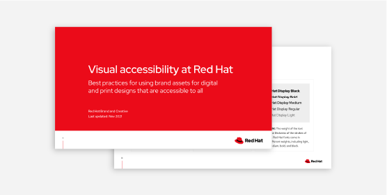
Red Hat's Visual Accessibility guidelines presentation deck

It’s important to consider how people with different abilities perceive text in your asset. Consider size, spacing, emphasis for hierarchy, and legibility. Learn more about accessibility at Red Hat.

Our font contributions

Open design is important at Red Hat because our approach to open source extends beyond acquiring and liberating software. We hope that if we make and share something that is useful to us, it can be useful to someone else as well. This is why we created fonts for everyone to use, learn from, and improve upon. Keep in mind that we do not use these open source fonts in Red Hat-branded materials.

Description goes here.

Liberation was created in 2007 to ease formatting issues when documents moved between open and proprietary office tools. It is built in 4 TrueType font families, including Liberation Sans, Liberation Sans Narrow, Liberation Serif, and Liberation Mono.

Description goes here.

Overpass was created in 2016 and has expanded several times since then. Based on Highway Gothic, the font was originally used on U.S. highway signs and features 20 styles, including thin, light, light italic, regular, regular italic, semi-bold, bold, extra bold, and black.

Functional type in Red Hat presentation templates

We created and open sourced a family of handwriting fonts for the Because we had to article series in 2018. It includes 6 styles, each representing the women in technology highlighted in the articles.

Red Hat logo LinkedIn YouTube Facebook Twitter

Products

Tools

Try, buy & sell

Communicate

About Red Hat

We’re the world’s leading provider of enterprise open source solutions—including Linux, cloud, container, and Kubernetes. We deliver hardened solutions that make it easier for enterprises to work across platforms and environments, from the core datacenter to the network edge.

Subscribe to our newsletter, Red Hat Shares

Sign up now
© 2022 Red Hat, Inc.