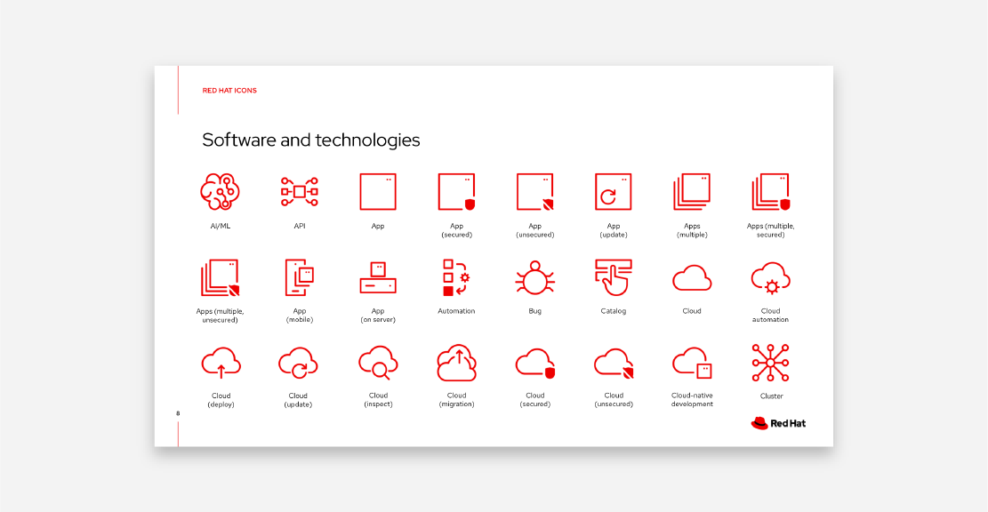
Our icon system is simple, clean, and open. Use standard icons to represent general technology concepts in marketing materials, presentations, web content, infographics, and diagrams. They’re intended to be used at small sizes, working best for sizes between 32 and 100 pixels. If you need a larger visual, use an illustration.
Icons
All icons use the same stroke weight and corner radii, show objects from the front when possible, use flattened perspective, and are made from geometric shapes. They're available in 3 colors—red, black and white—but they can be changed to any color in our brand palette.
Icons in use
Icons are a quick way to add visual interest and reinforce main points in presentations.
Icons can be used in diagrams or charts to quickly call out important components or operations.
On the web, use icons in cards or lists to add visual interest.
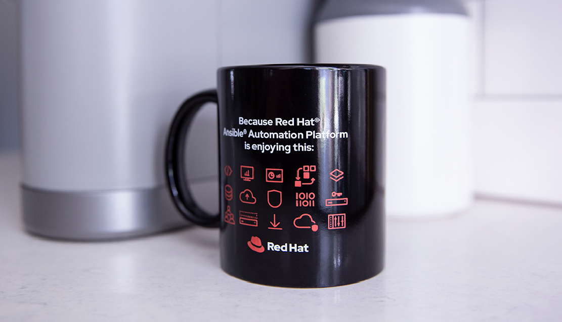
Icons work well as small visuals on swag like mugs or buttons.
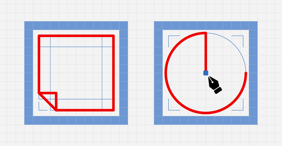
Use the icon as designed without modifications.
Do not add elements to create a different shape or combine icons. Use an illustration for complex concepts.
Use icons to complement text or other small design elements. They work best between 32 and 100 pixels in size.
Do not make the icon too large. The icon should complement other design elements, not be the dominating visual.
Use the icons as provided without modifying the line weight or dimensions.
Do not change or distort the dimensions of icons or add weight to the lines.
Only use icons from the Red Hat icon library.
Do not use a mix of icons from the internet, another brand, or the previous Red Hat library.
Icons as patterns
Patterns are a way to use our icons to create visually interesting graphics quickly. Use patterns to aid recognizability for a program, team, or product. Carefully consider where you use a pattern to ensure that its placement makes sense. Remember that whitespace is a key element of our brand, so not every blank space needs to be filled.
Experiment with one icon by varying the size and fill.
Try picking a set of related icons and using them at the same size.
Try adding connecting lines to icons in a set. The lines should match the weight of the icons.
Experiment with color and scale, but always include Red Hat red to reinforce our brand.
Icon patterns in use
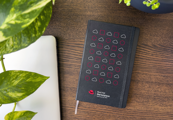
Icon patterns are a great way to customize a piece of swag for a team, product, or program while staying true to the Red Hat brand.
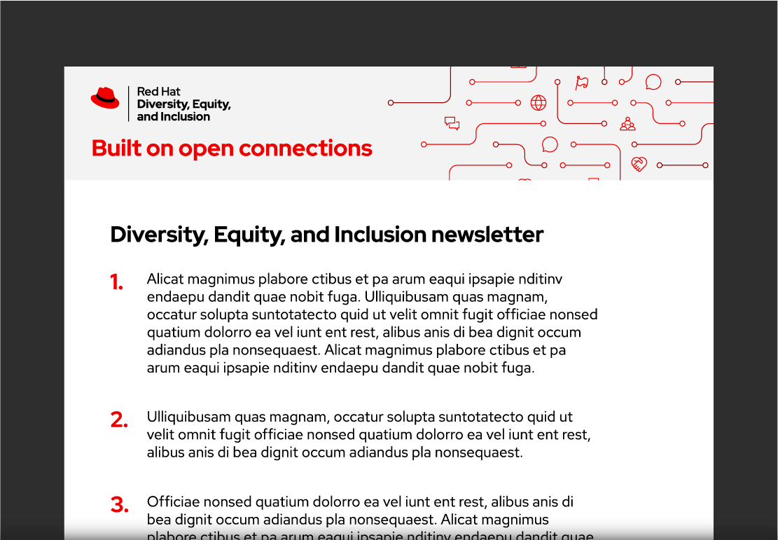
Icon patterns can be added to small spaces on documents or email headers to add visual interest without adding clutter.
Vary 1 or 2 elements to create rhythm and interest.
Do not use the same icon with no variation. It’s boring and repetitive.
Use a pattern that is not too complex and that does not interfere with text or other elements.
Do not use a pattern in a way that makes it difficult to read the message.
Use icons independently and connect them using lines or other shapes.
Do not combine icons together in a way that makes them lose their meaning.
Only use standard icons in an icon pattern.
Do not mix different styles of icons or illustrations in a pattern.
Creative Commons
Using a Creative Commons license lets us share our icons and UI icons with our customers, partners, and communities.
This icon is licensed under a Creative Commons Attribution 4.0 International license. If you redistribute this icon, Red Hat should be given attribution. For individual uses, such as a diagram or presentation, attribution is optional.